Know the next word before it comes
Details
Product
My Microphone: Voice Amplifier (Karaoke Mode)
How do you turn a use-once utility into a habit app? This case is about a Bluetooth mic and amplifier that people opened to solve a problem and never came back — and the karaoke layer built on top of its existing engine to give it a second life.
Problem
A subscription app with no reason to reopen
The app does one job well: turn a phone into a mic. Once that job is done, nothing brings you back. It's a task-app running on a subscription model — you pay for something you use once and set aside.
Solution
Karaoke layered on top of the existing audio engine
Import a song → AI separates vocals and times the lyrics → the phone becomes a synced performance prompter, mic and recording still one tap away. The existing audio engine stays untouched; karaoke layers on top.
Result
The first feature built for return visits
The base app is opened to solve a problem; karaoke is opened for an evening with friends — the first feature built to bring people back, not just help them finish and leave.
Impact
Feature shipped and live. D7 retention grew from 15% to 16.2% (+1.2 pp, +8% relative).
Design decision
- 01/ Karaoke entered through the existing Music tab, not a new button
- 02/ Recording engine untouched — karaoke layers on top
- 03/ Failure states designed alongside success states
Metrics
- Karaoke discovery rate (users reaching it without a button)
- Repeat opens weekly (recurring, not one-off)
- Completion rate on tracks model can't fully process
Context
Every feature in the app makes one recording better — none make the app worth opening again.
Mic types, EQ, effects and output routing all sharpen a single take. Karaoke is the first feature aimed at the day when nothing needs recording.
Process
App analytics showed a clear pattern: most users completed a single task — set up the mic — and never returned. Usage split into isolated sessions with no return trigger. Karaoke was scoped as the answer to that, not as another audio feature.
Most of the work went into two things the karaoke flow depended on. First, what the separation model could and couldn't promise: some tracks have no lyrics match, some separations run long, some fail outright. That uncertainty became a spec rather than a late discovery — every screen was built with its "the model didn't answer" sibling at the same time.
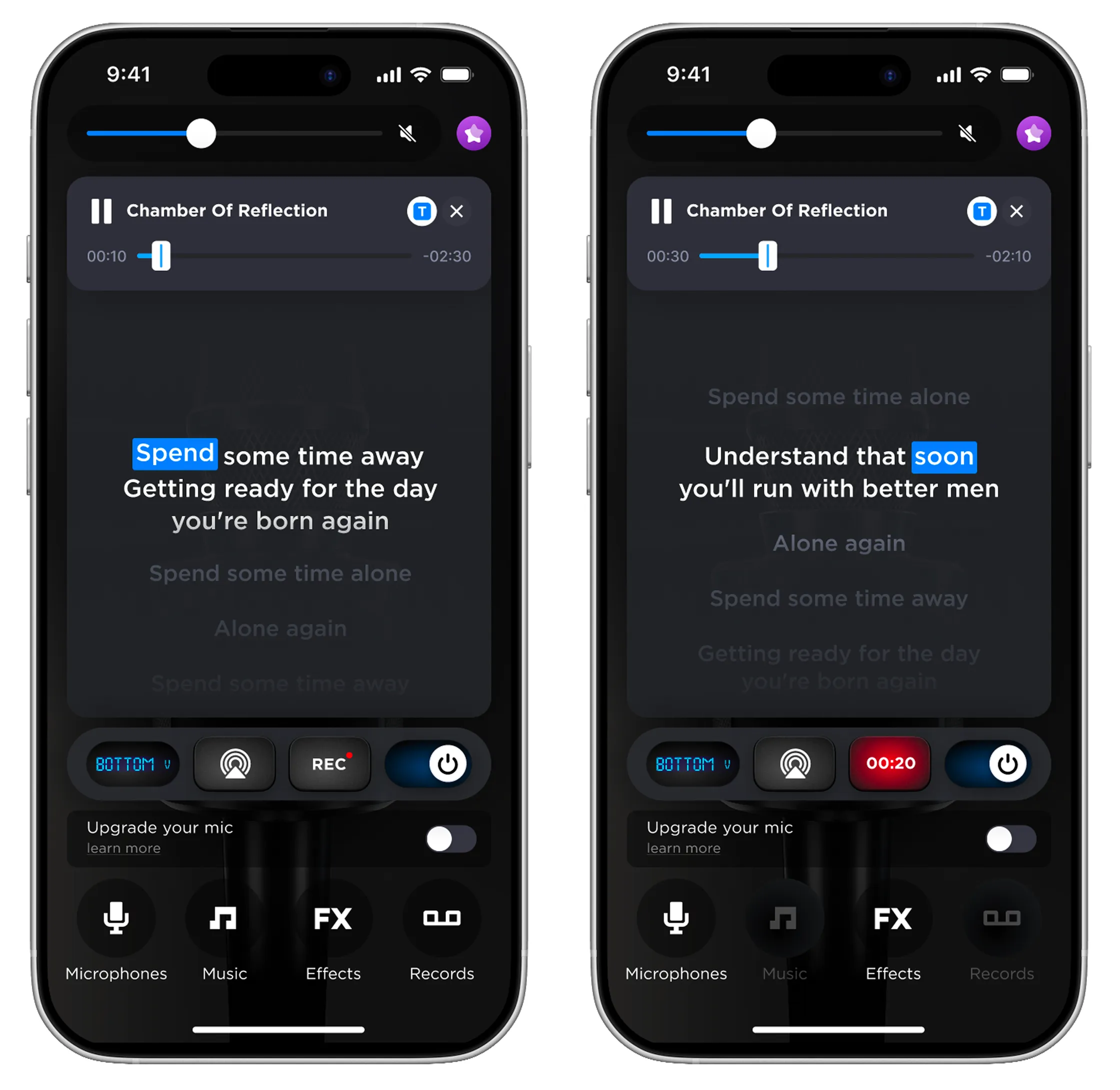
Second, the mic screen itself had to be rebuilt. The controls were a tall stacked block in the middle of the screen — input selector, AirPlay and REC side by side, power toggle beneath. A lyrics panel needs exactly that vertical space, so four controls were compressed into one horizontal capsule pinned above the tab bar, REC absorbing the elapsed-time readout, and the top bar cut from three icons to one. Karaoke couldn't be added without redesigning the mic screen — and that structural work is where most of the design effort went.
Solution — How It Works
Three moves, and each one has a version that works when the AI doesn't.
Import — bring a song in from the files or cloud.
Separate — AI splits vocals from instrumental and syncs the lyrics; when it can't, the same screen carries an honest status instead of an error page.
Perform — the screen becomes a lyrics prompter while mic and recording stay in reach.
Design 1/6 — Where Karaoke Lives
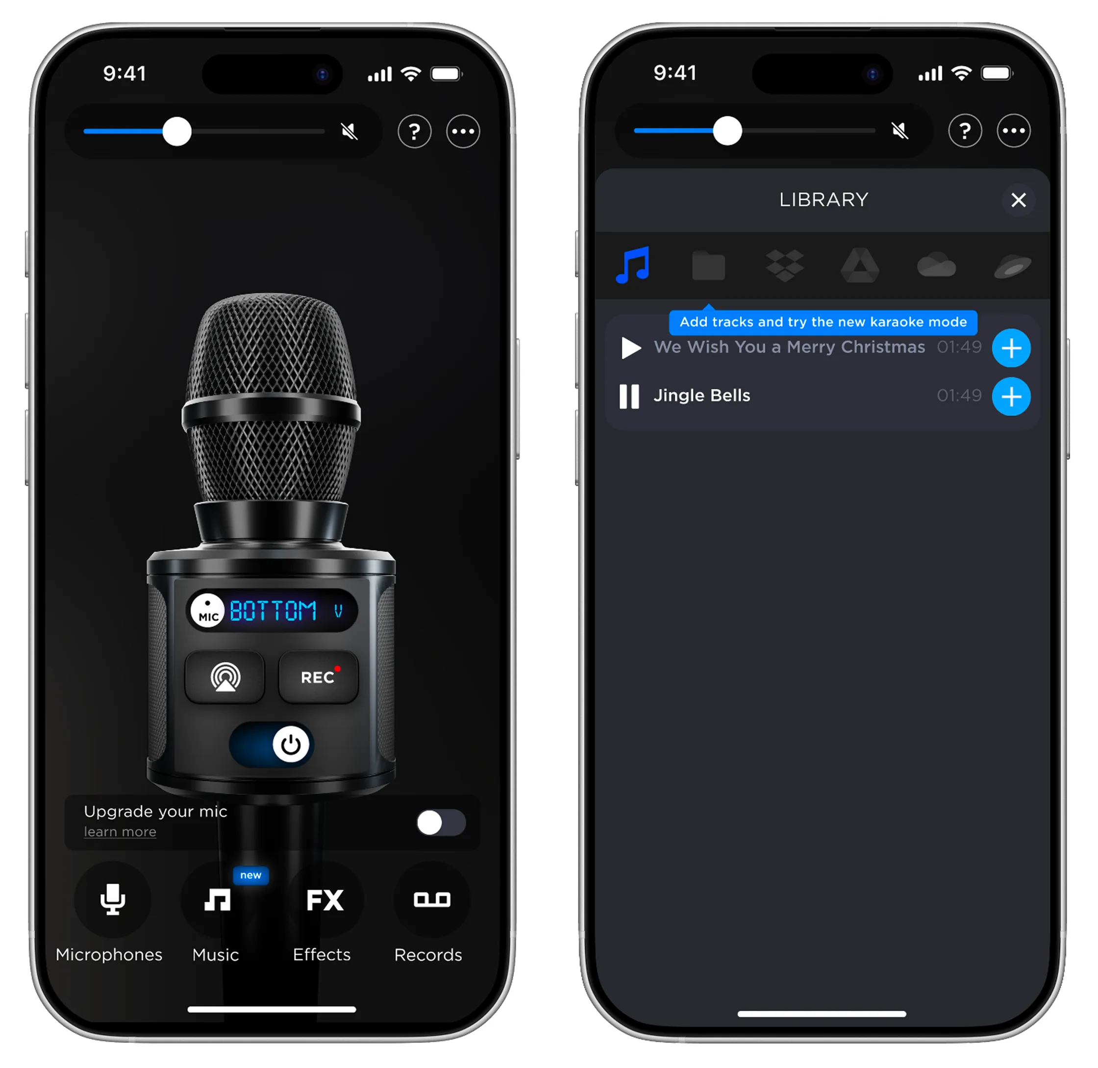
My first instinct was a dedicated karaoke button in the bottom tab bar. I dropped it. The bar already carries four destinations — Microphones, Music, Effects, Records — and a fifth would have shrunk every touch target on the app's most-used control. Worse, it would have framed karaoke as a separate mode you switch into, when the whole premise is that karaoke is what you do with a track you already imported. It belongs behind Music, where songs already live, and is announced by a walkthrough tooltip on the main screen instead of a permanent icon.
Design 2/6 — Getting the First Track In
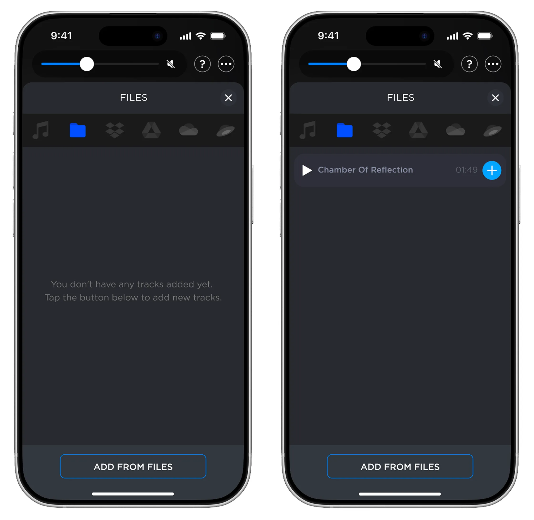
Karaoke is worthless without a song, so the import sheet had to work from an empty library. One picker row covers every source — Files, Dropbox, Google Drive, OneDrive, Yandex Disk — and the empty state just points at a single action.
Design 3/6 — Pointing at the One Tap That Starts It
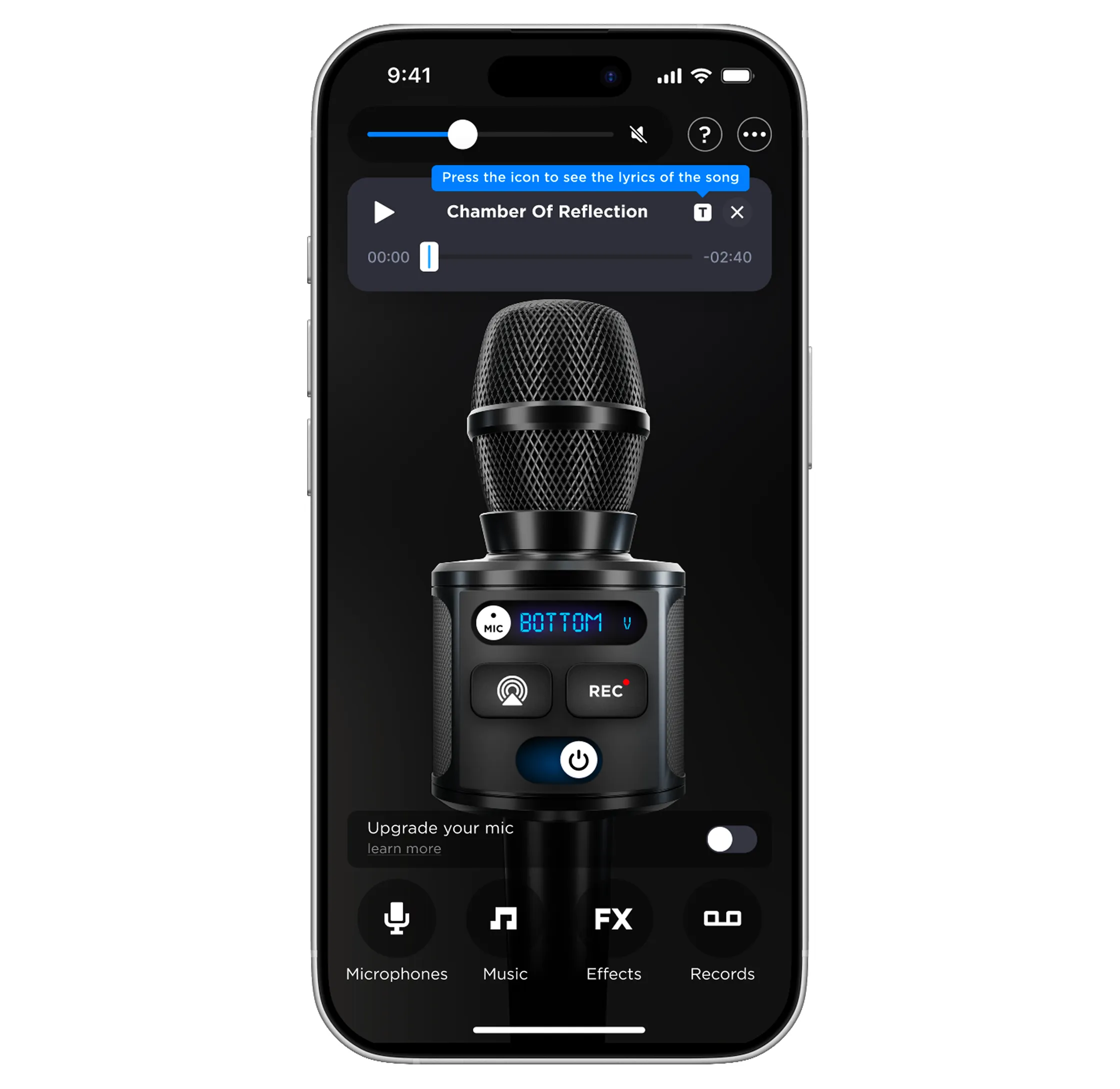
The track loads into a floating player over the mic artwork. A hint points directly at it guiding the user what to do next.
Design 4/6 — Waiting Without Losing the Room
Separation takes real time, and the wait is exactly where a first-time user decides whether this feature works. The status names what's happening rather than showing a bare spinner, and cancel stays available so nobody feels held.

Design 5/6 — When There Are No Lyrics
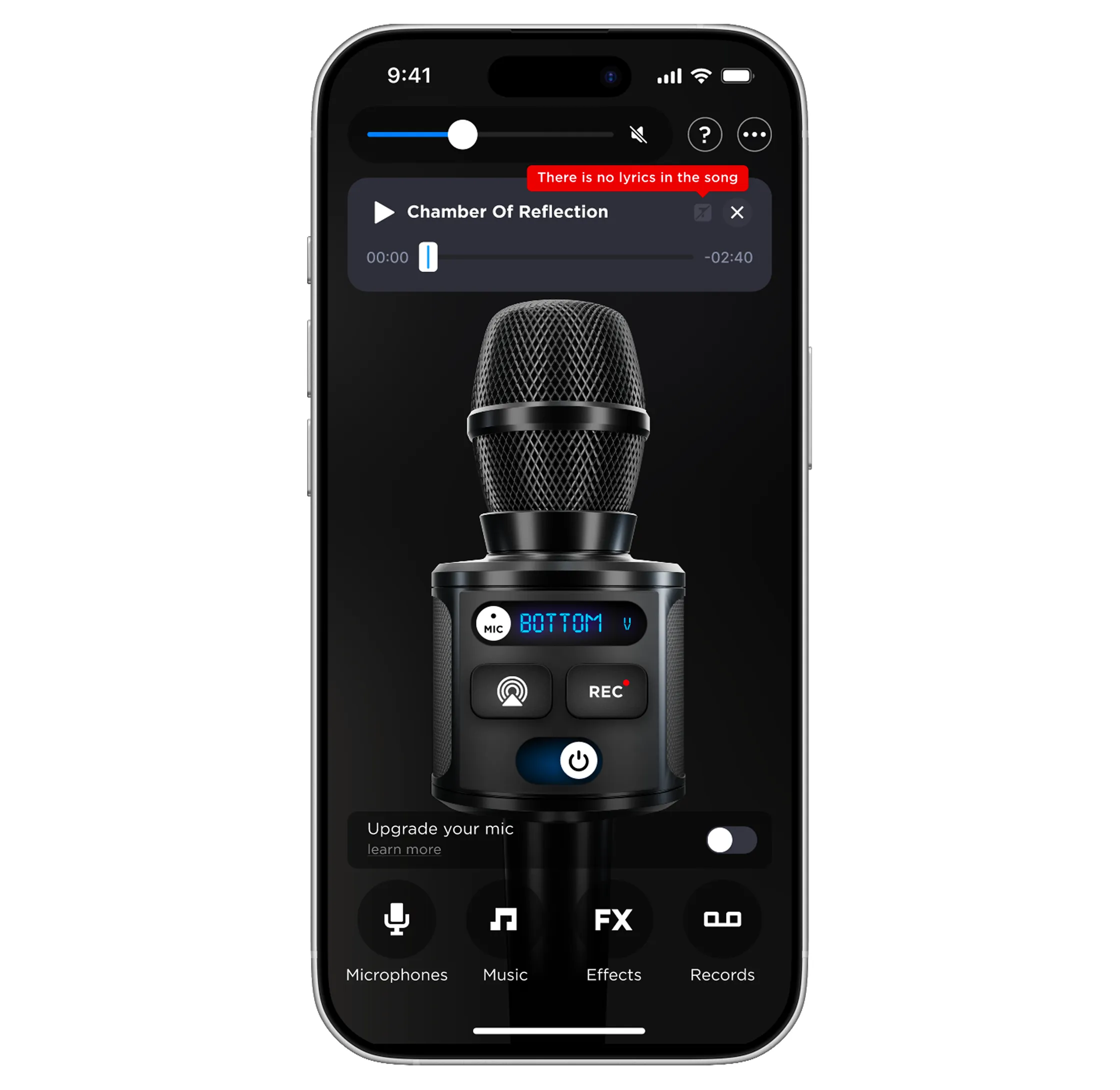
Some songs simply have no match. Instead of an error screen, the same hint component that teaches features delivers the bad news, and the track still plays.
Design 6/6 — The Lyrics Panel Takes the Screen
The panel slides up over the mic art, lyrics scrolling under a gradient mask with the active word highlighted, while the rebuilt control capsule keeps mic, AirPlay and recording within reach throughout the song.
Promo and Store Presence
The experimental call was to rework the first two screenshots rather than add a new one for karaoke. Those slides carry the highest view rate before a scroll or an install decision, so the message lands there instead of waiting further down a sequence users may never reach.
Reflections
- Rough accuracy was enough to feel like fun.
- Users judge vocal separation by how it sounds in the room, not by how precise it is. Getting it mostly right meant people sang along instead of critiquing the split — accuracy mattered less than vibe.
- Honesty kept more sessions alive than speed.
- When the AI can't separate a track cleanly, showing that upfront and without drama worked better than hiding the problem or optimizing the happy path.
What I Learned — and What I'd Do Next
- I should have also designed the social layer from the start.
- Karaoke is inherently social; the current flow assumes one singer. A duet or shared-session mode is the natural next step — and scoping it early would have shaped the screen layout differently.
- Give the habit its own memory.
- Karaoke history, past sessions, easy re-invite for the same group — so the feature earns return visits on its own instead of relying on the novelty of first use.
- Spread the "AI absorbs the work" principle further.
- Auto-tagging or auto-tuning recordings the way karaoke auto-splits a track — applying the same pattern of invisible AI labor to the app's core recording features.