A shared space that can end cleanly
Details
Product
Meridian
A private space for two people in different time zones, where every screen opens with the hour it is where the other person is. The exit was designed before the entrance.
Problem
Nothing built for a couple is built to end
Shared-couple products assume the relationship continues. When it doesn't, photographs, voice notes and answers sit entangled with someone else's in a product that has no vocabulary for separation. Competitor analysis found something worse: in established couple apps, material from a past relationship resurfaces in the next one.
Solution
Rules written before screens
Five commitments. Four are accepted by both people before anything exists: encrypted and visible only to the two of you, either person can delete their own material, either can unpair with 30 days before anything is gone, and no location, read receipts or activity status. The fifth is permanent — a new relationship never inherits this one.
Result
A trust model that survived the build
Every promise has screens that keep it: ownership assigned at capture, an ending that freezes instead of deletes, a designed flow for the person who didn't choose it, and full account recovery, since nothing transferable means no back door.
Impact
MVP launches in November 2026, free. Metrics to be measured post-launch.
Design decision
- 01/ Both accept the terms separately
- 02/ Ownership is assigned at capture
- 03/ Unpairing freezes for 30 days
- 04/ A space is never reused
Success measure
- Both contribute by day 7
- Restore within 30 days
- Both permit export
- Uninstall without unpairing
Context
Long-distance couples have every messaging app ever made. None of them leaves a record with a shape.
Three research reports — on daily rituals, on maintaining existing bonds, and on habit mechanics — converged on the same thing: people want an archive, not more notifications. The category sells the opposite. Last-seen, location, streaks and check-ins work by creating small continuous obligations, and they work hardest on whichever person is already anxious.
Problem
A product two people share is a product either of them can be trapped in.
Shared space creates shared hostages: photographs you'd want back, answers you'd rather leave behind, a record whose ownership nobody agreed. Most products handle that with a support ticket. Designing the separation first also answered the day-one question, because people put more in when they know how to get it out.
Process + Key Insights
The competitor finding decided the hardest rule.
In a review of established couple apps, I found that some allowed spaces to be reused, counters to carry over, or memories from a past relationship to resurface. These choices reduce re-onboarding, but they also suggested that the product did not understand what it was holding. This made separation—not onboarding—the defining design constraint: a space ends, is exported, or stays exactly as it is.
Ownership is decided at capture, not at the breakup.
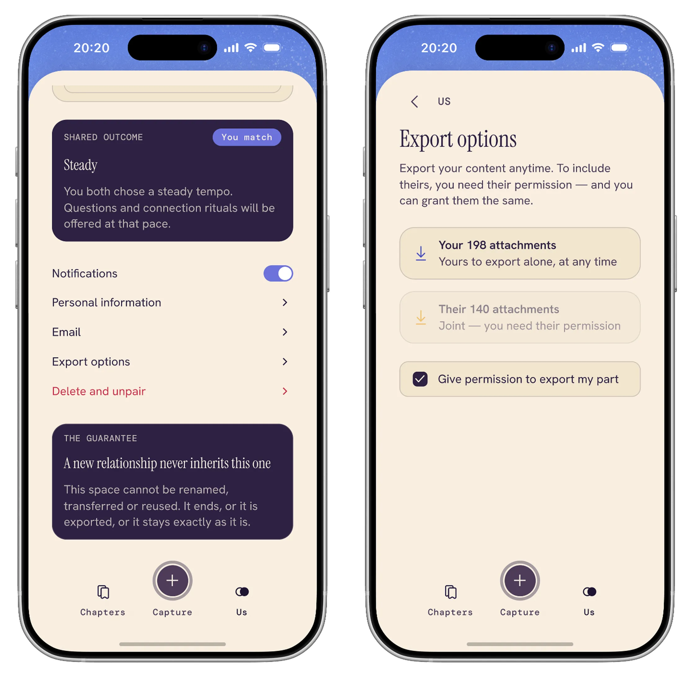
Every moment belongs to whoever made it, which lets the export screen be honest rather than diplomatic: your 198 attachments are yours at any time, their 140 need permission, and one checkbox grants the same back. There is no way to request — a request is pressure, a grant isn't.
An ending is a window, not an event.
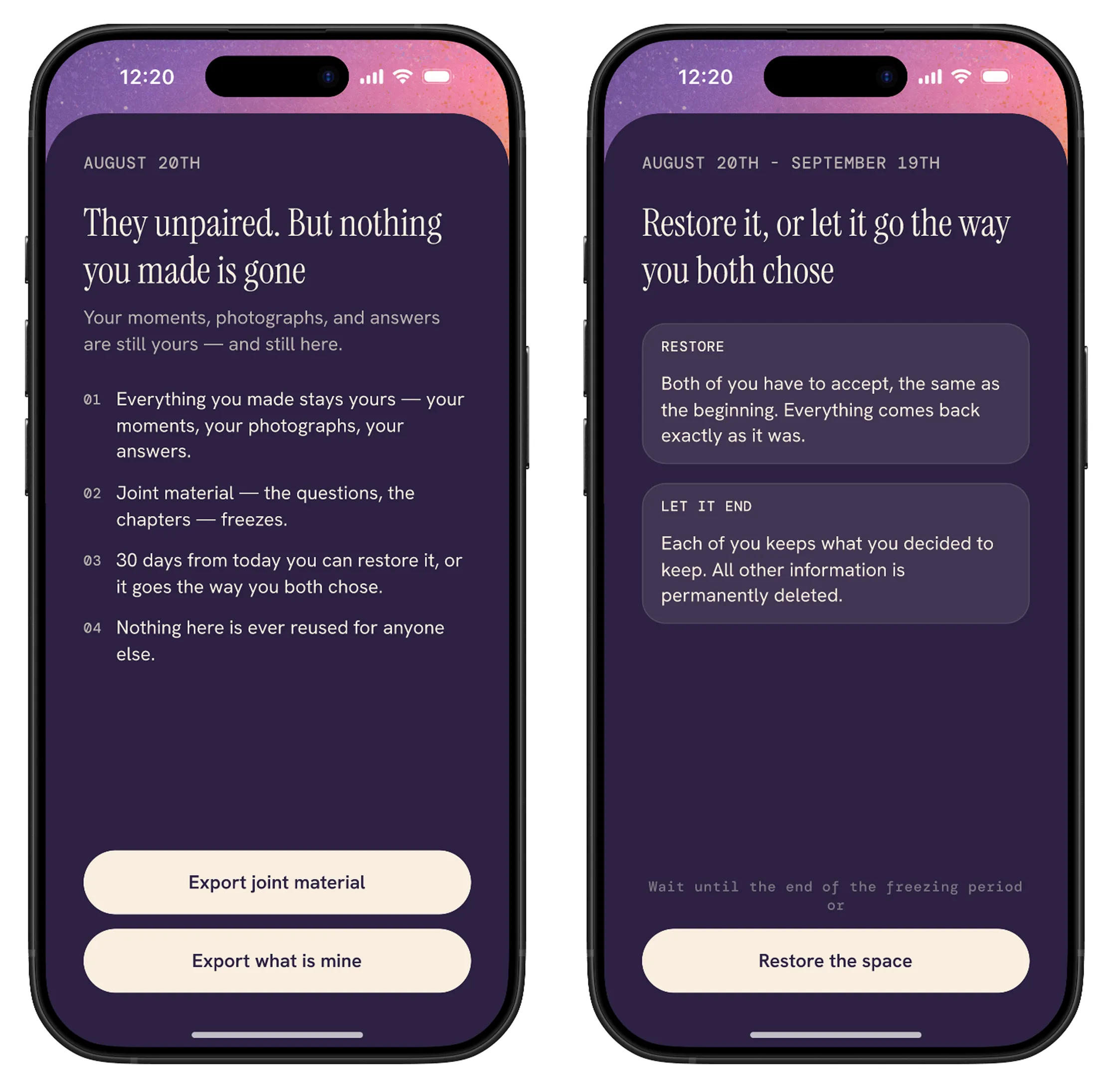
Unpairing freezes for 30 days and offers two labelled doors: restore, which both people have to accept, as at the beginning; or let it end, where each keeps what they chose. The 30-day window makes an impulsive unpairing recoverable while preserving a clear path to separation.
The person being left needs a screen too.
The partner's side of an unpair is its own flow, and its first line isn't an apology: they unpaired, but nothing you made is gone. It has permitted and non-permitted variants, so it states what this person can actually export instead of hiding the asymmetry behind an error.
Solution — How It Works
Meridian — a shared archive for two people in different time zones, where what you contribute stays yours and the way out is visible from the first screen.
Onboarding — one person names both people, both cities and the first photographs; the other joins with a code.
Capture — a note, voice message or photograph added to their day rather than sent as a chat message.
Today — the day feed, numbered from day one, one reply per moment.
Chapters — months with covers and counts of moments, rituals and questions.
Us — tempo, personal information, export, the guarantee, and unpair.
Design 1/10 — Consent, Before Anything Else
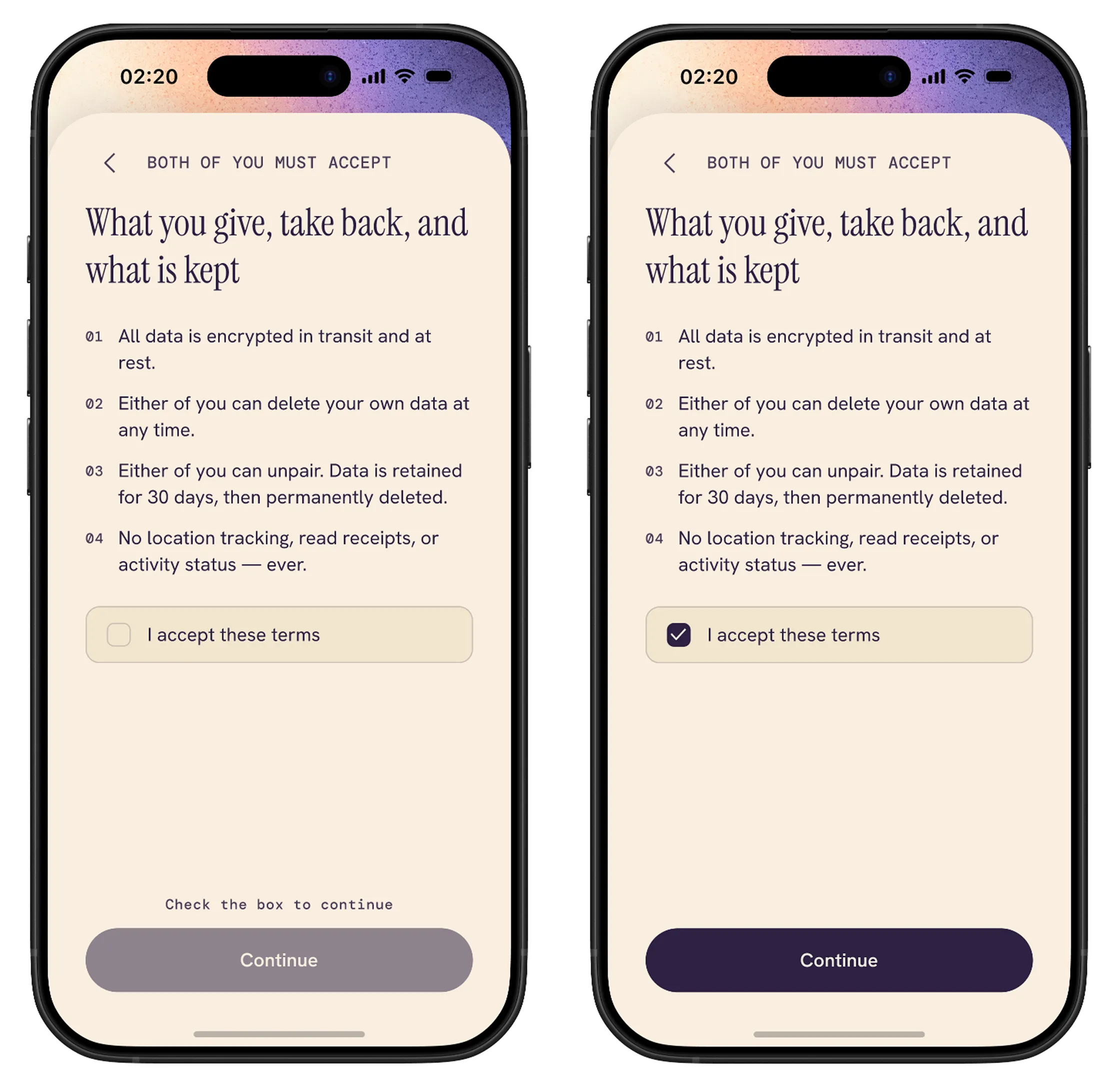
Four commitments, a checkbox, and a button that stays disabled with a plain reason. Each person reads it alone, and nothing else opens until they accept — not registering an email, not entering an invitation code.
Design 2/10 — Onboarding: Who, Where and When
Second design chapter.
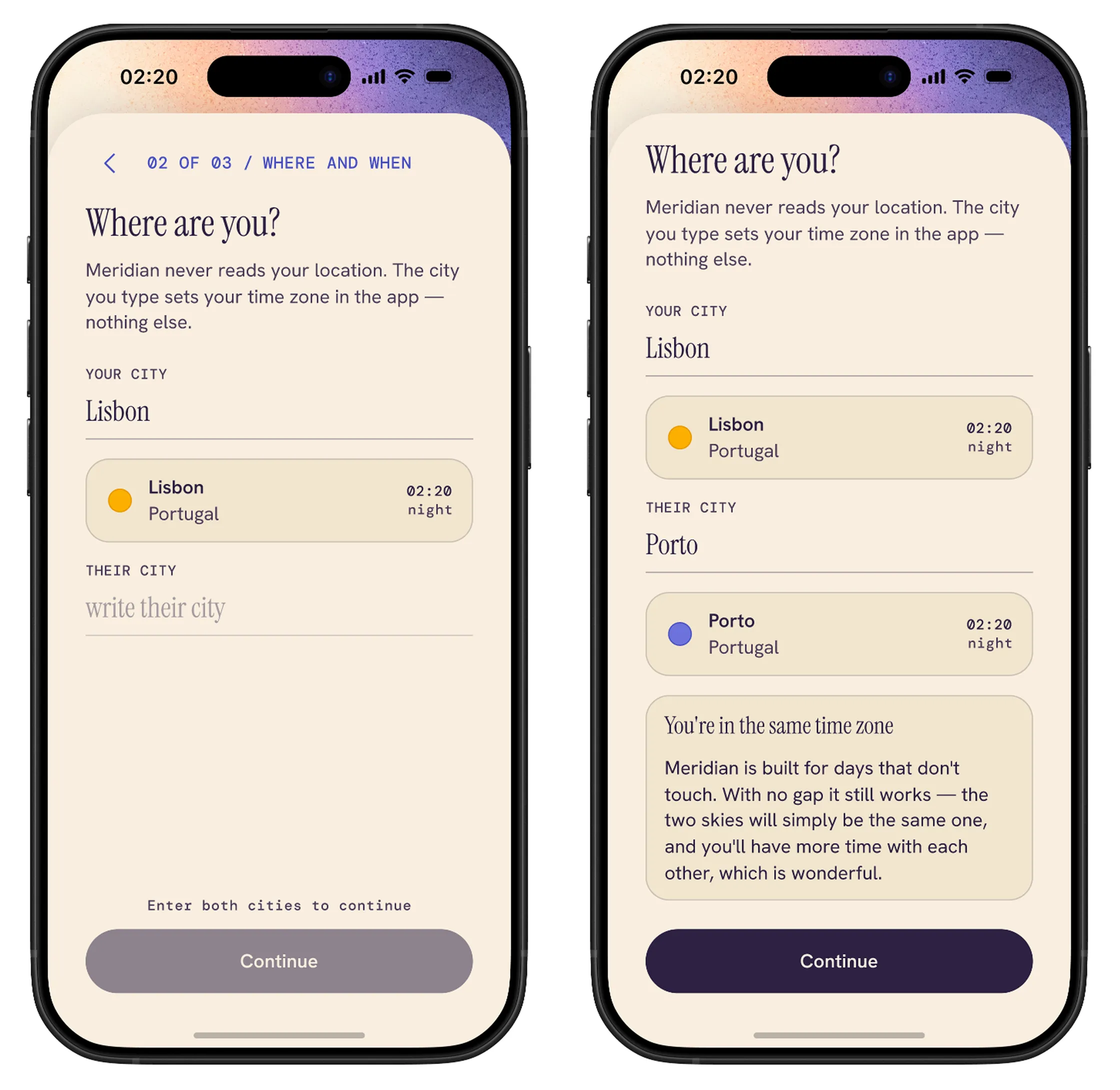
The person starting the space enters both names, then both cities. Meridian never reads your location — the city you type simply becomes an hour in this app. When the two cities turn out to share a time zone, the premise stops being true, and the app says so instead of blocking the step.
Design 3/10 — The Invitation, as a Gift
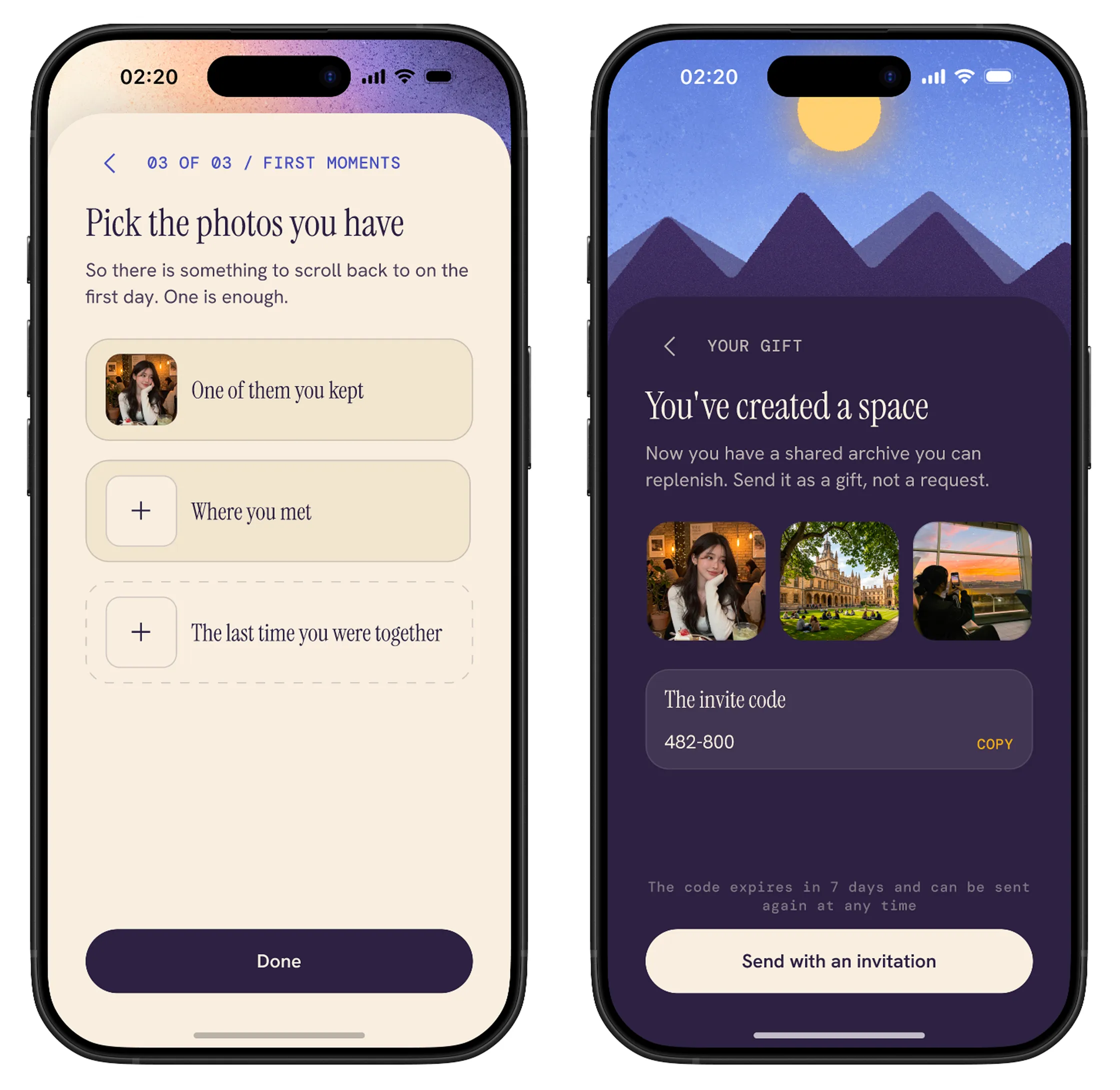
Each person picks photographs they already have on their phone. The space is furnished before anyone is asked to join, so what arrives isn't a request — it's an archive with something already in it.
Design 4/10 — Accepted, or Never Opened
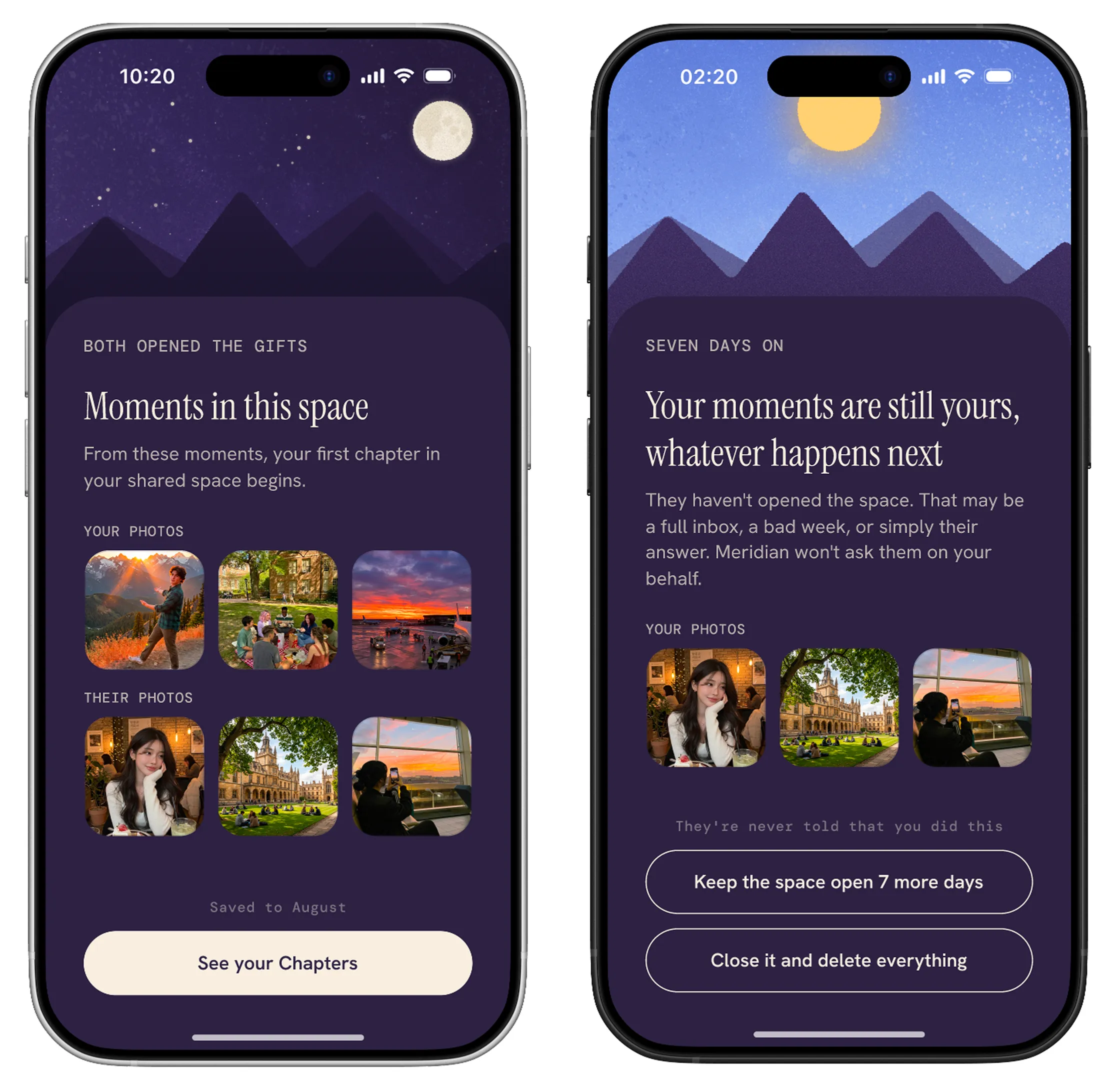
An invitation has two outcomes, both designed. When the second person accepts, their photos join the first set and the screen names what just happened. If unopened after seven days, there's no countdown or reminder. The only choices are to keep the space open another seven days or close and delete everything, without notifying them.
Design 5/10 — Capture and the Day Feed
Text, voice and photograph, each with its offline and permission-denied variants. Everything lands in a feed grouped by day rather than by clock, because two people eight hours apart share no timestamp. Each moment is labelled you or them, so every day exists as two screens and both were designed.
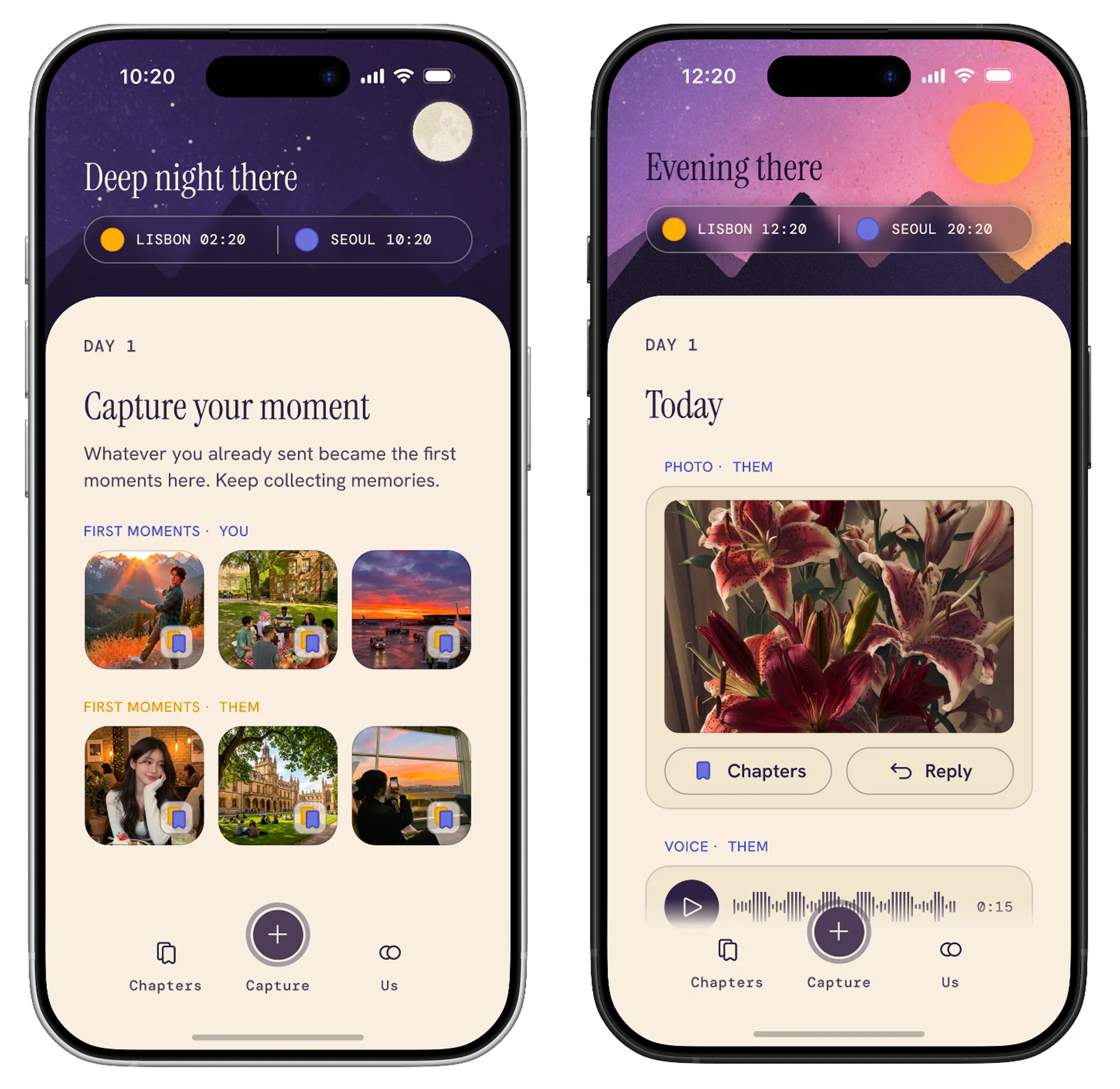
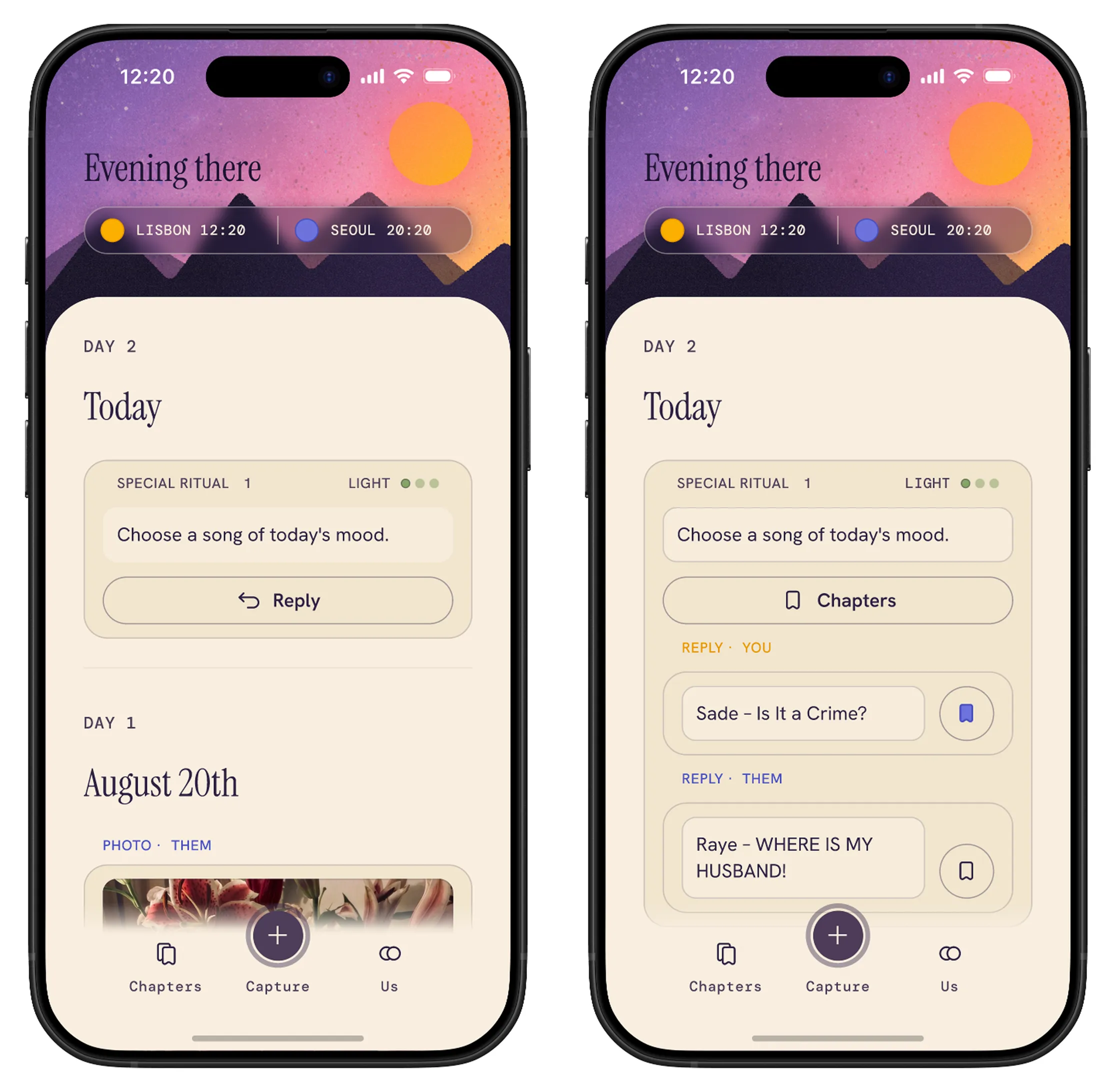
Design 6/10 — Rituals and Questions
A ritual or question arrives at the pace the pair set, declaring its weight before opening. Each answers once; both answers sit in a card labeled you and them. A bookmark saves an answer into the month's chapter, so what is kept is chosen. Unanswered prompts stay in the day they belong to.
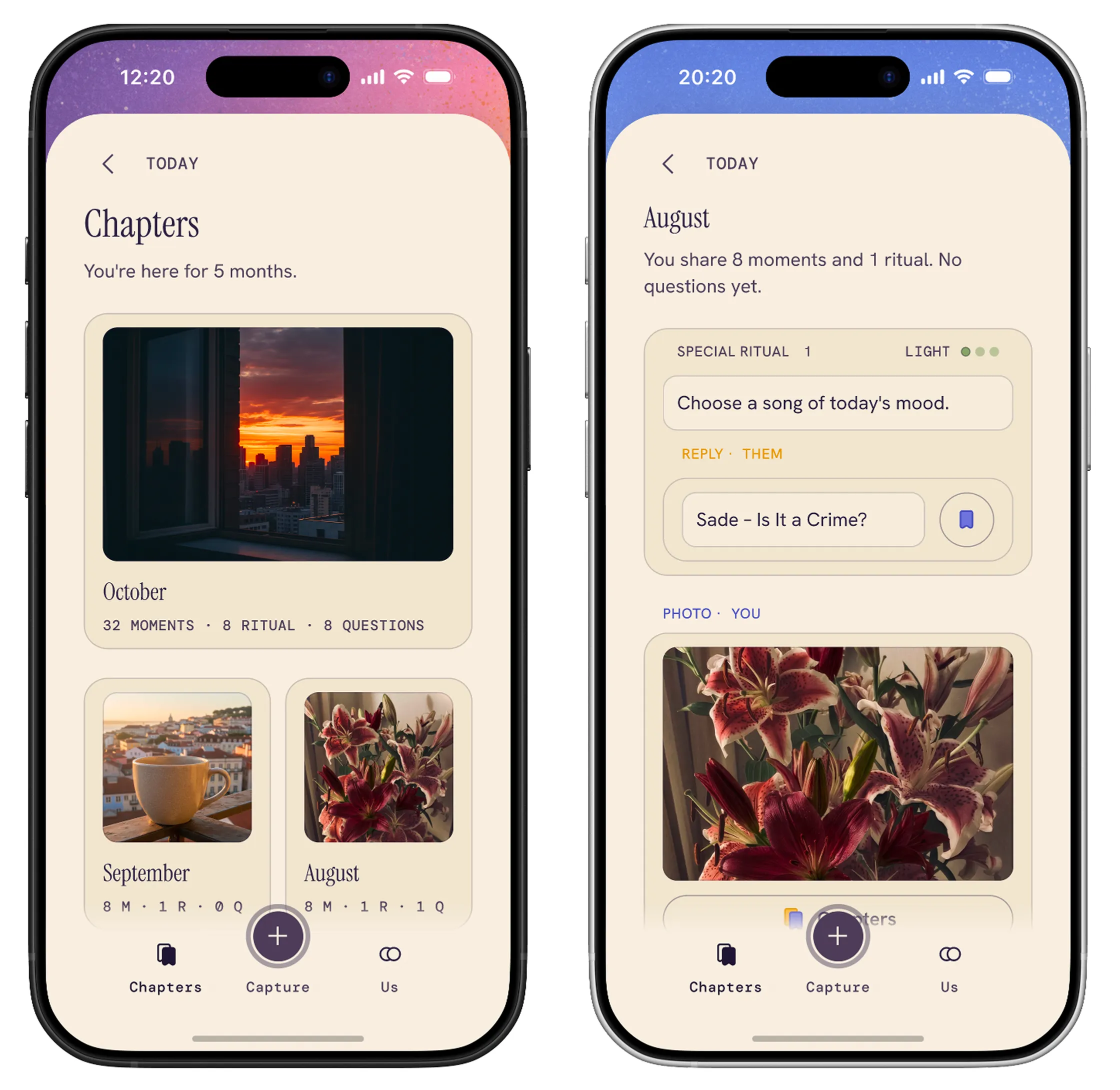
Design 7/10 — Chapters
Months become chapters. The overview answers the question: you're here for five months. Each month has a cover and a count: moments, rituals, questions. A chapter holds what you chose to keep, not everything.
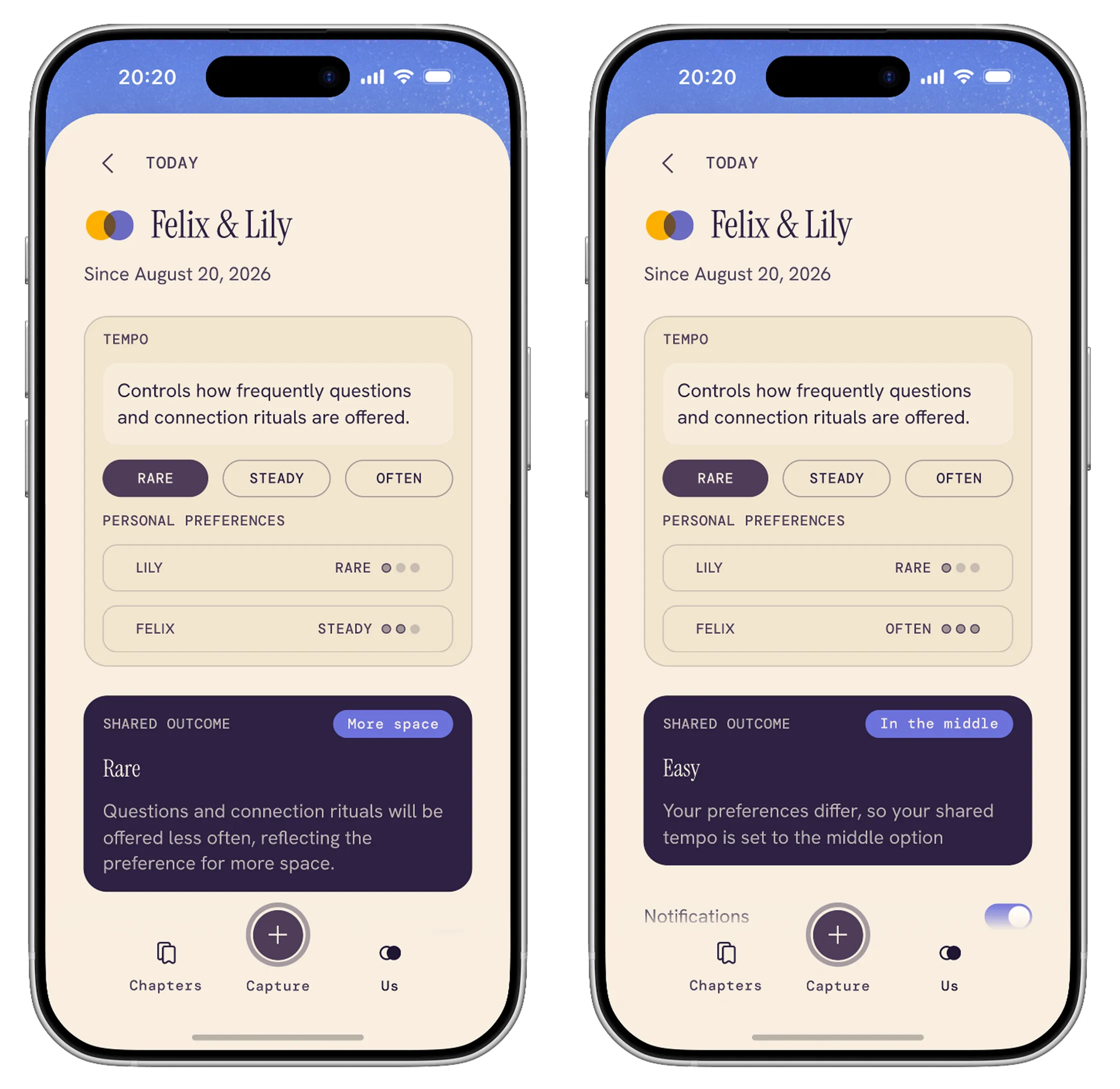
Design 8/10 — Tempo, a Setting Neither Person Owns
Each person privately picks rare, steady or often, and the app resolves the two into one shared outcome. When the choices sit next to each other it takes the one asking for more space. When they sit at opposite ends it settles in the middle. Both preferences stay visible, so nobody has to ask their partner for less contact.
Design 9/10 — The Guarantee, and Export
The guarantee sits permanently at the foot of settings, not in a policy document. Above it, export makes ownership legible in three rows and one checkbox: what's yours alone, what's joint, and the permission you can give.
Design 10/10 — Unpair, from Both Sides
One side gets a confirmation, a reason, a 30-day freeze and the option to export. The other gets a notice that states what survives: everything you made stays yours, joint material freezes, and in 30 days it is restored or it goes the way you both chose. An ending has two users, and only one of them chose it.
Store Presence
The app icon and store screenshots come after the MVP build is locked, so they aren't part of this project yet. Meridian launches in November.
Reflections
- Writing the exit first made every other screen easier to decide.
- A rule you can't break is a faster design tool than a principle you can.
- In a product for two people, there is no neutral default.
- Every default takes a side on whose comfort matters more, so each one went to whoever had less power in that moment — the person being left, the one who wants less contact, the one who didn't start the space.
What I Learned — and What I'd Do Next
- I designed for a pair where both people show up.
- Lily and Felix both capture, both reply, both set a tempo. The likelier state is lopsided: one contributes most days, the other opens the app once a fortnight, and the relationship is fine. The feed makes that imbalance countable and the only exit on offer is an ending.
- Everything was tested against my reasoning, not against a couple.
- I evaluated the concept through desk research and self-critique, but not with couples. My first study would test whether the upfront terms are understood, whether they affect what people contribute, and whether both sides of unpairing feel clear and fair.
- The archive has no way in except scrolling.
- Chapters work at five months. At three years there's no search, no filter by person, no jump to a date, and the export is a folder rather than a document. I cut those to ship, and they're the first thing to break once the archive becomes the reason to stay.