From camera roll to vocabulary
Details
Product
Photo Snap (Flashcards Maker)
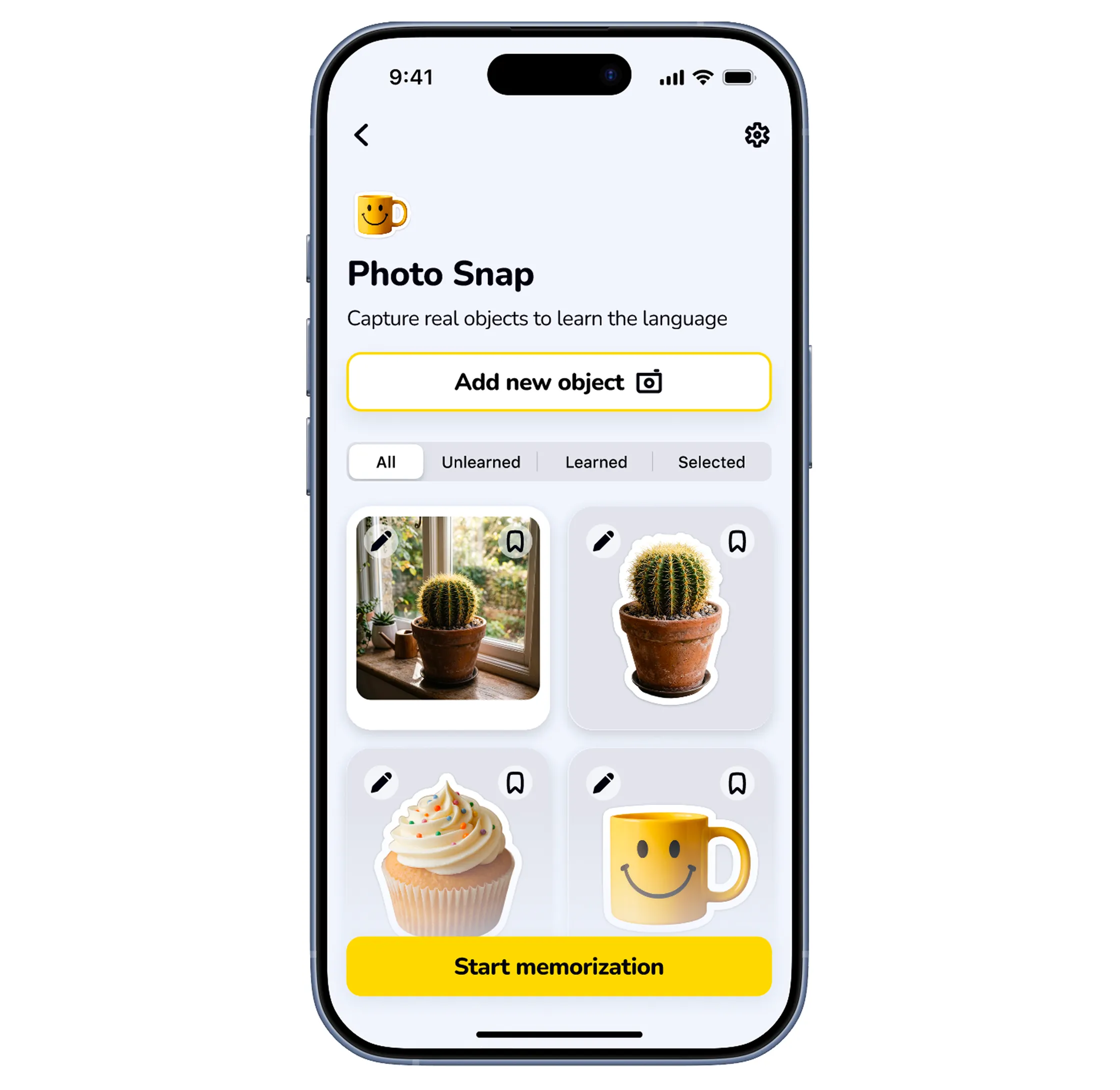
A camera-based way to create vocabulary cards. This case is about one cactus, photographed twice — once in good light, once badly — and why the second photo produced my most important screen.
Problem
Two Inputs, One Missing Path
Manual entry and text-prompt generation require knowing the word first. A camera fixes that — until the AI meets a cluttered windowsill and fails. Then what?
Solution
A Failure That Doesn't Look Like One
When recognition fails, there's no error screen. The same field the AI would have filled simply opens — a friendly tooltip, a ready keyboard, and the translation still completes on its own.
Result
Delivered, Then Refined
Zero dead ends shipped: clean recognition, wrong guess, or no guess — every path ends in a saved card. Two post-launch revisions sanded the rest.
Impact
Design decision
- 01/ Editable AI result
- 02/ Same input field for AI/manual
- 03/ Fallback for recognition failure
- 04/ App Store promo screen
Target metric
- Retention (fewer frustrated exits)
- Card creation completion rate
- D1 retention (no dead-end on first use)
- Store page conversion rate
Context
Flashcards Pro already had typing and text-prompt generation — paths that can't fail: a keyboard always works.
Photo Snap added the app's first state where the system might not deliver. And the words it serves are exactly the cactus-on-the-windowsill kind: known by sight, not by spelling.
Process
Interviews and review patterns aimed the feature at the card-creation stall — people gave up adding words, not studying them. Photo Snap targets exactly that step.
My first flow answered that cleanly, and only for success. Then validation with real photos did what validation should: it broke my design. I photographed my own windowsill — clutter, backlight, three plants in one frame — and the model shrugged. Users would hit that wall at the moment of highest trust: their first snap. I rebuilt the failure into the same interaction as success — no error page, just the field, open and waiting.
Solution — How It Works
My first flow answered that cleanly, and only for success. Then validation with real photos did what validation should: it broke my design. I photographed my own windowsill — clutter, backlight, three plants in one frame — and the model shrugged. Users would hit that wall at the moment of highest trust: their first snap. I rebuilt the failure into the same interaction as success — no error page, just the field, open and waiting.
Capture — frame the object, take the photo.
Recognize — AI proposes a name in an editable field.
Recover — on failure, the same field reopens for manual entry; the translation then fills in on its own.
The fallback reuses the exact success-state UI — a tooltip and an open keyboard, not a separate error screen. Failure and success are one flow wearing two expressions.
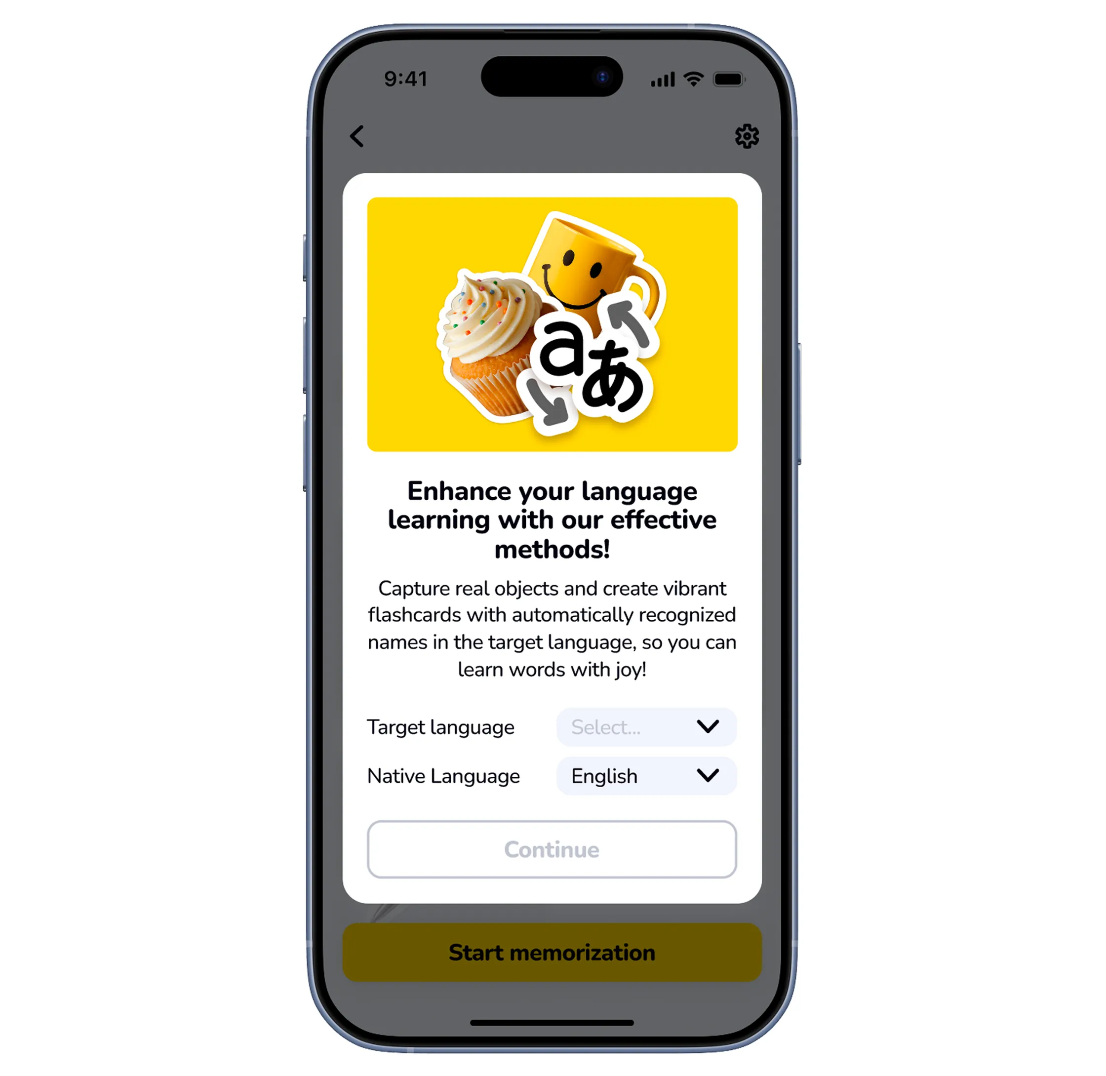
Design 1/5 — Onboarding
Inline on first open — explainer, language pick, into the module. Setting up the trust the failure state must not break.
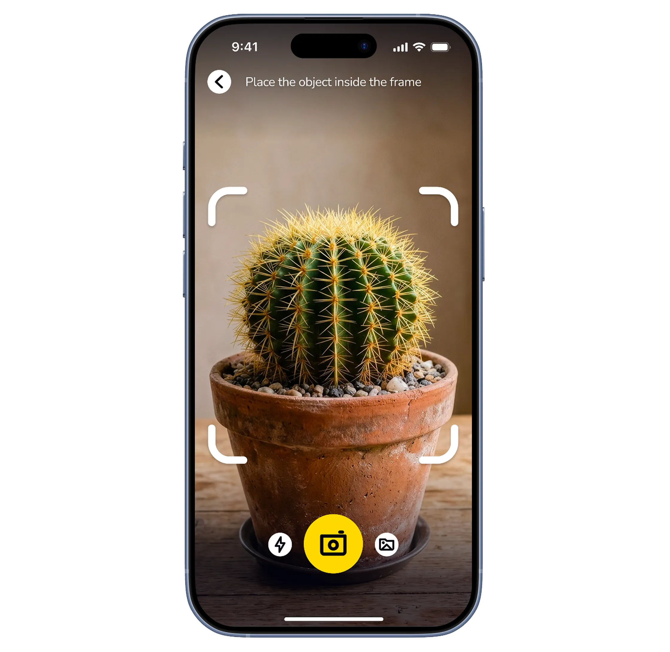
Design 2/5 — Capture
A snap frame guides the shot — my first line of defense: a well-framed cactus fails less.
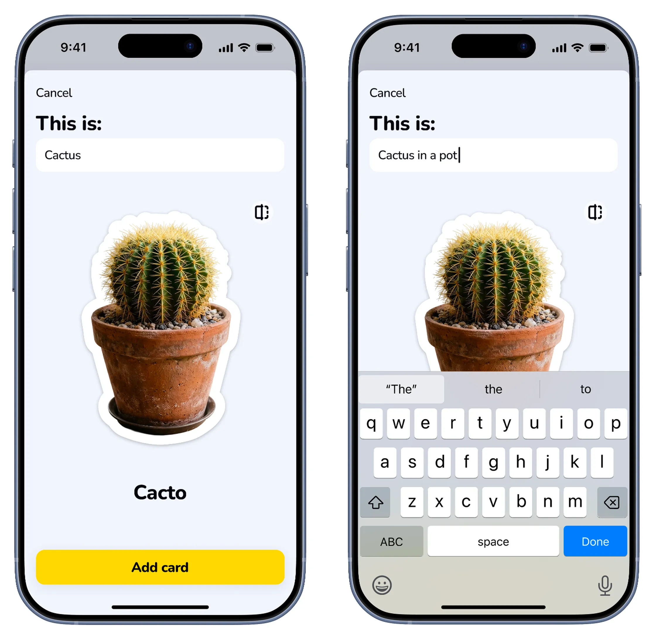
Design 3/5 — Editable Result
Good light, clean frame: the shimmer crosses the photo and "Cacto" lands in an editable field — one tap from correction, translation completing on its own. Even success is designed like a soft failure: there is no "the AI is right" state, only "the AI proposed."
Design 4/5 — Recognition Failed
Same cactus, worse photo — backlit, cluttered. The AI admits it: a friendly tooltip on the same field — "Oh no! We're having trouble figuring out what's in the photo. Could you please let us know?" — keyboard already open. You type "cactus"; the translation fills in on its own. The story continues instead of ending.
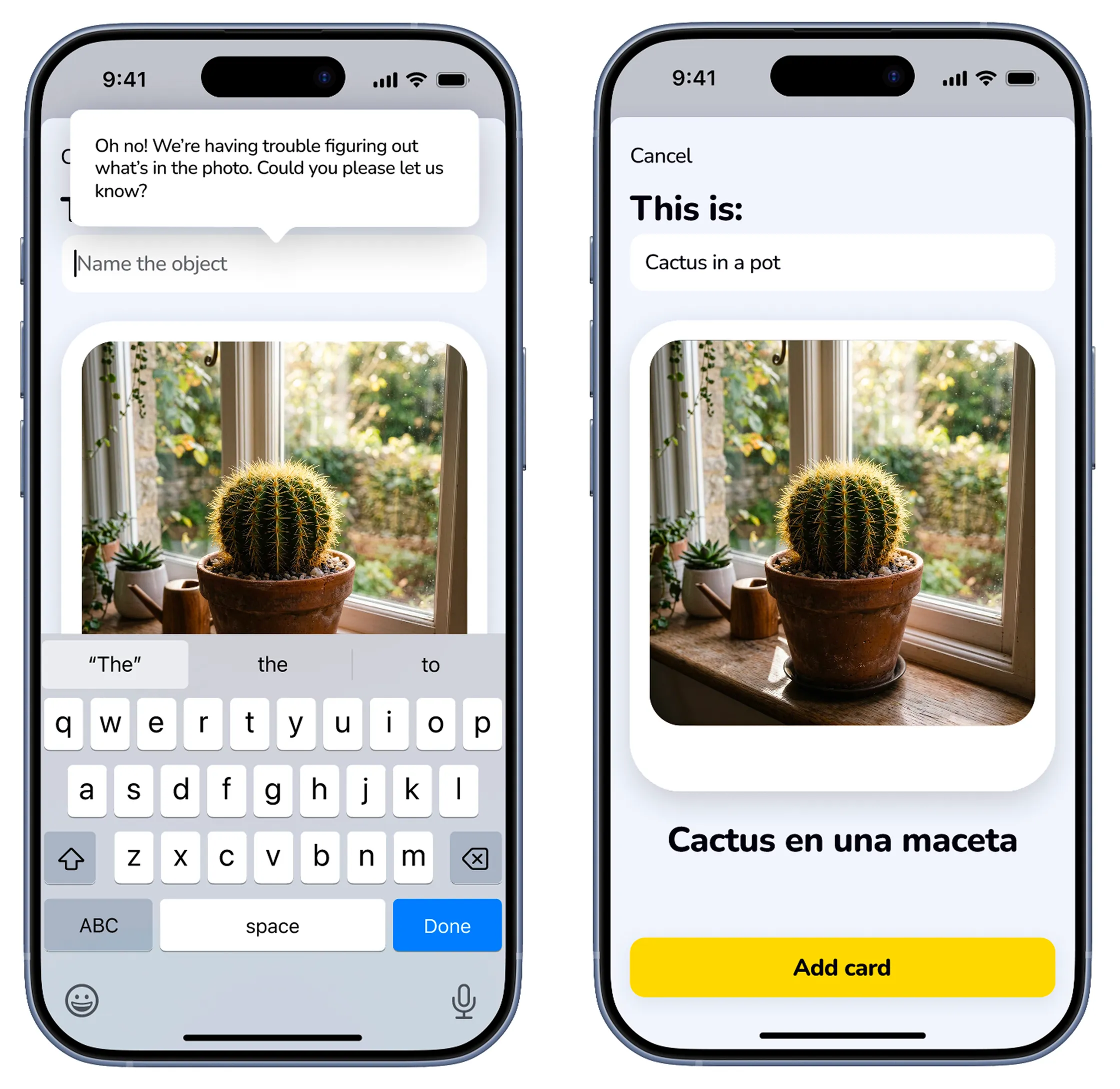
Design 5/5 — Saved to the Deck
Both photos end here identically: a card carrying its image — cut-out sticker or full shot. The deck doesn't remember which path you took. That's the point.
Adaptation Across Devices
The failure state ported intact to Mac (sidebar-and-window, photo import) and iPad (two-pane) — a dead end avoided on three platforms.
Promo and Store Presence
The store screenshot sells the happy path — as it should. The failure design is why the promise survives real windowsills.
Reflections
- The failure path should've been designed first, not patched in after.
- Recognition was never going to be 100% — it deserved equal weight from day one. I'll never again design an AI feature starting from success.
- The best fallback doesn't look like a fallback.
- It looks like the same feature, with one more tap. Reusing the success UI wasn't efficiency — it was the design.
What Would I Do Next?
- Learn from the failures.
- Log (with consent) which photos fail most — cluttered frames and bad light aren't edge cases, they're windowsills.
- Beyond nouns.
- You can photograph a cactus; you can't photograph "prickly." Video or described scenes carry the idea further — and multiply the failure modes this philosophy is built to absorb.
- Closing the loop with the AI text-generation path.
- Photo Snap and the existing text-prompt AI generation currently work as two separate features with no shared logic. Cards created via photo could feed into topic clusters the same way prompt-generated sets do — so a photographed cactus and a typed "gardening vocabulary" prompt end up reinforcing the same deck instead of living apart.